

Transforming a low-traffic area of the website into a useful tool, commonly requested by users to make planning their everyday lives a little easier.
Initial research
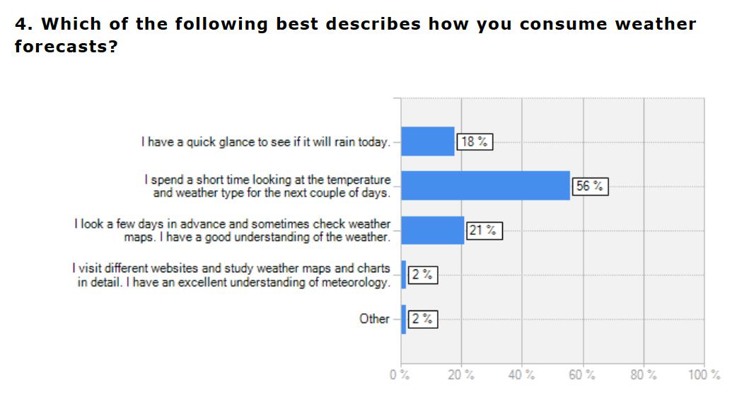
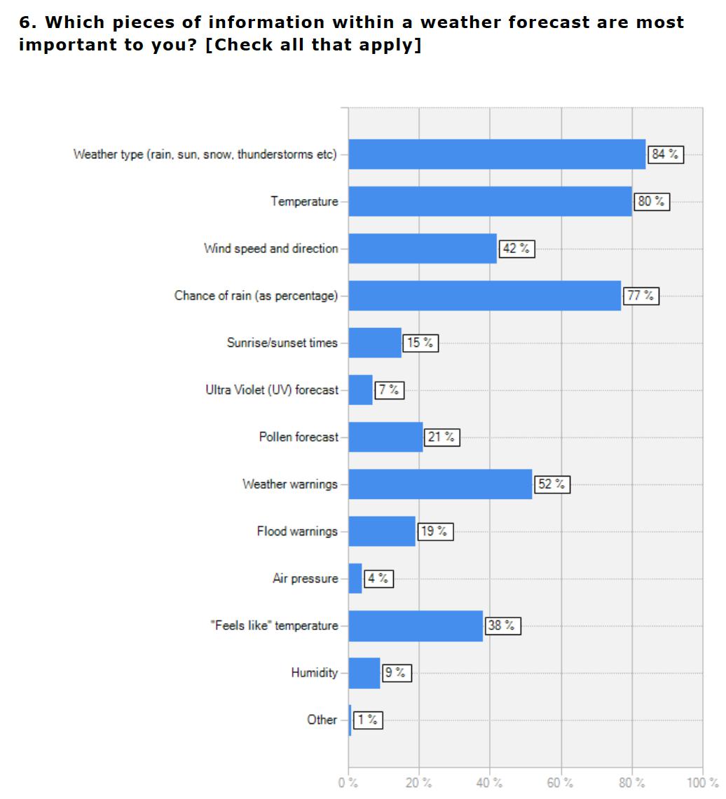
In order to expand the Sky News weather section from just a text summary and broadcast video, we first needed to understand existing user behaviour and what weather information they need to help plan their everyday lives. A number of surveys that I designed helped to inform us.

Competitor review & feature analysis
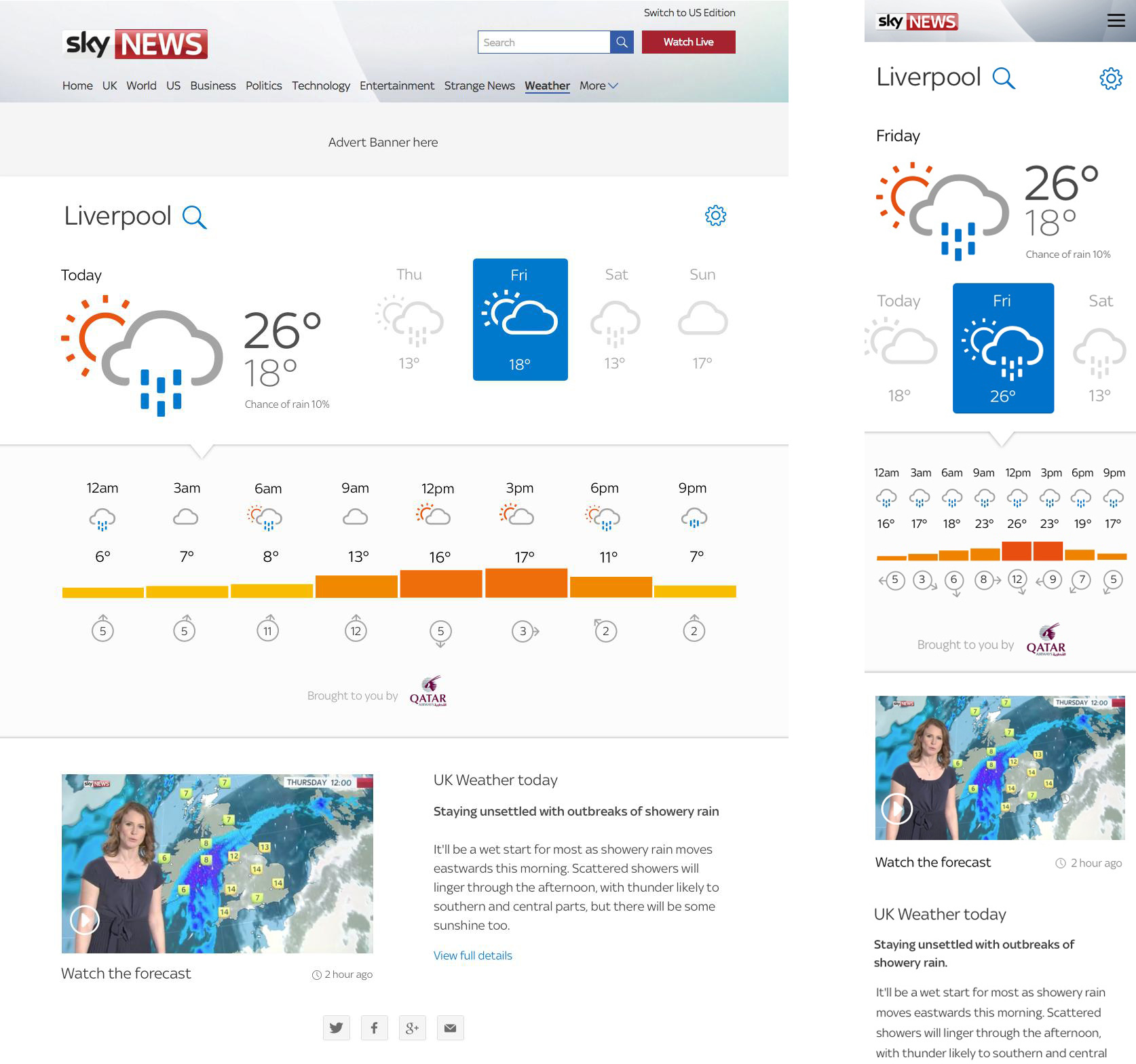
The weather is a great British fascination. The goal of our forecast tool was to meet user expectations and not reinvent the wheel or cause re-learning for users to get to the key information that they need.
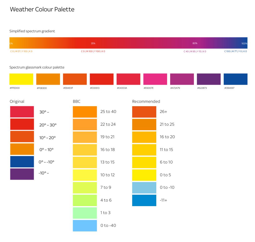
A close look at well-established forecast providers uncovered some key themes/areas that we shouldn't "mess with". One example were the colours used to indicate temperature. A quick guerilla test with colleagues showed us that if we departed from using colours that are already established in user's mental models, we could have created a confusing temperature chart.
Iterative design and testing
At this point I wireframed an initial design while collaborating with the developers to understand the functionality available from the API that the tool would use. The wireframes were used to detail the UI and interactions for a higher-fidelity prototype created by the UI designer.
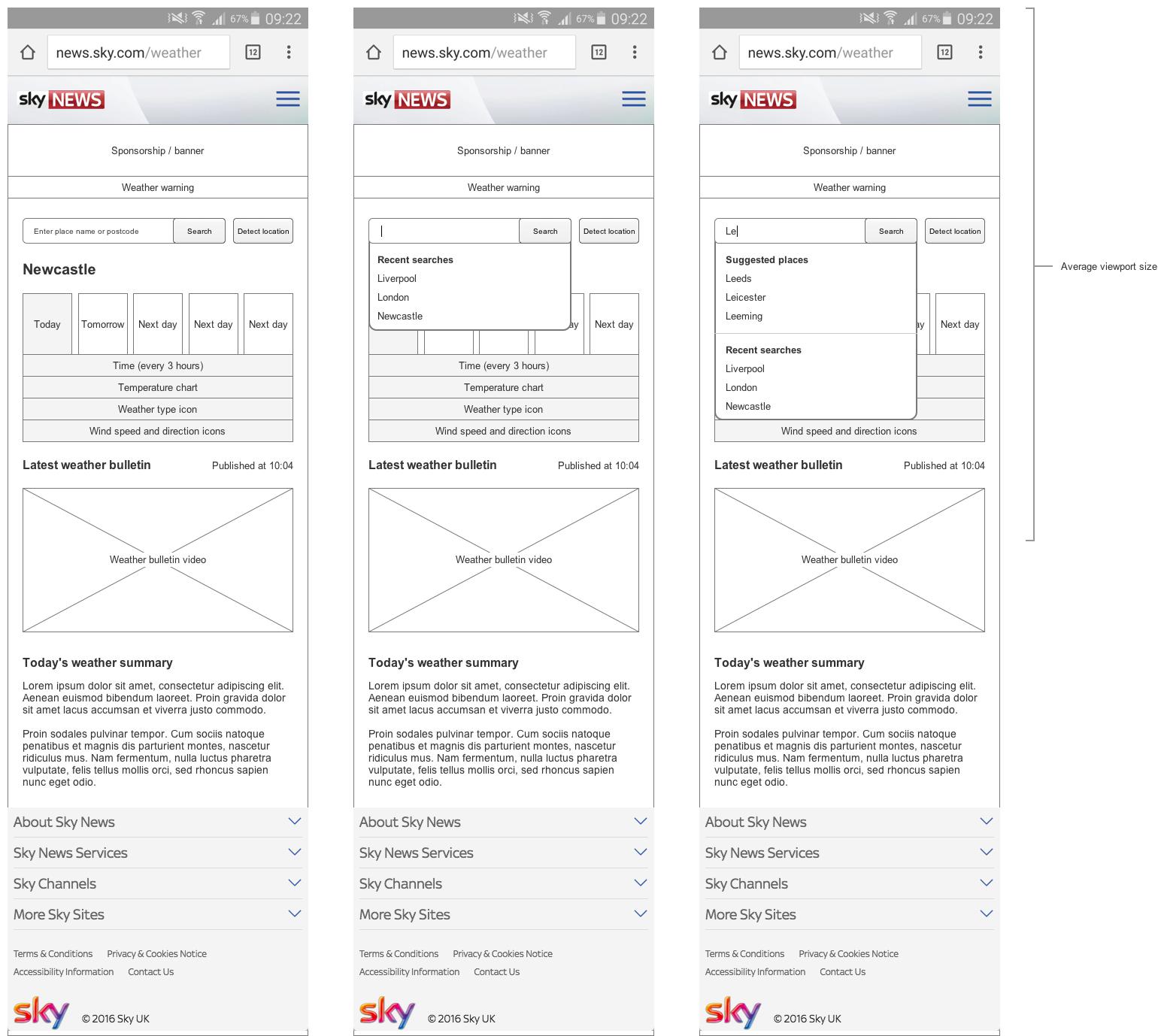
I tested this prototype at Sky’s user research lab in Leeds with existing Sky News website users.
These users were encouraged to use the wireframe as they would any other website to gain the weather information they need for their everyday life. Observation of these users going about their usual tasks immediately identified a number of issues and opportunities. Such as the temperature and wind speed units not being clear and how to handle location searches.
Changes were made and we retested a number of times until we were confident we had the best possible product to build (within the constraints of the allocated time and resource).
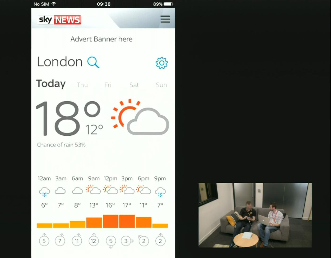
A still from one of the user research recordings.
Build support
The developers were involved during the design stage so already had good visibility of what we were designing and the rationale behind the decision making along the way.
I supported the AGILE 2 week sprints, attending stand-ups and planning meetings to provide detail on the desired functionality of the tool and to take away requests for design assets back to the UI team.
Measurement
Once the tool went live, I closely monitored the analytics data to see how the tool was being used.
Overall visits to the weather section grew by 23% and returning users were up by 12%.
We also ran a permanent feedback survey in the tool to gain qualitative insight into where there may be areas for improvement or new feature ideas.